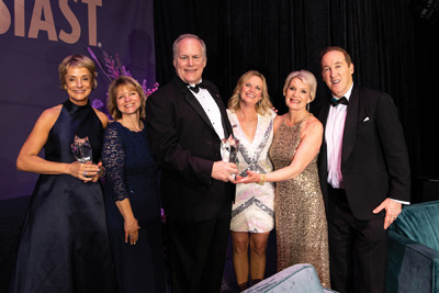
Why does a company rebrand itself? For Santa Rosa-based Summit State Bank, it was a desire to update a “tired” image, says Roni Brown, the bank’s senior vice president and marketing director, and a veteran of the banking industry.
“When I first joined Summit five years ago, I felt that its brand didn’t represent the energy and the synergy that was happening within the bank. I first suggested a refresh of the logo and our colors to the bank’s previous president. Then when Jim [Brush] became president, he agreed with me that our brand could use an update. I told him I’d put together a proposal that showed we wouldn’t have to spend a lot of money to do it, that we could make the change relatively inexpensively. He told me to go for it.”
It took only a few months of planning and creative thinking to get the ball rolling, and Summit announced the change in January.
“We’re refreshing our brand to better reflect how we are keeping pace with the ever-changing banking industry and the ways people do their banking,” said Brush in a prepared statement. “We are investing in technology to make banking simple and offering the latest products and services. Our new look better matches our unique position as a community-focused bank that is committed to investing in our employees, our customers, and the community. One of our strengths is our culture of caring for each other.”

Brush says the idea of adopting a new logo gained traction over time. “It had been talked about for two years, with the occasional comment in our marketing meetings about doing this or that with rebranding. There was a general discussion among staff that took a few different shapes and wiggles. So as we got closer to needing to replace our signage, the decision was made.”
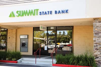
The Summit logo has transitioned from blue and bronze to bright emerald green and warm blue, using a modern sans-serif font and anchored by a green “summit.” Brush says they wanted some type of green that would “pop” well. “We felt it was a good, contrasting color. And we moved away from what I called the ‘football’ mark in our old logo in favor of a summit.”
Worth the wait
The bank was first founded as a savings and loan institution more than 30 years ago, and the newest logo is only its third during that time, says Brown.
“We didn’t make a big splash that we’d rebranded, but the average customer noticed the change, more than I would have thought,” says Brush. He’s also been happy with the way the new logo appears in print in the bank’s advertising, and also on its social media pages.
“We’re very active on social media and we’ve had a lot of positive feedback about the new look through those sites,” adds Brown. “People really seem to like it.”
The bank’s older outdoor signs had been in place at all locations for about 15 years, and would have to be replaced soon anyway, says Brush. “We are particularly excited to put up the new signs at our headquarters on Bicentennial Way. It’s a blue glass building and the old sign sort of blended in. We know the new green one will really stands out.”
There were some timing issues and slight permit delays in installing the new outdoor signs, but by August, the Rohnert Park branch was updated. “We anticipate that most of the remaining branches will be updated with the new logo this autumn. The wait will be worth the outcome,” says Brown.
The interior of each branch also underwent subtle changes. “Traditionally we used window overlays or other signage that shouted out our specials,” adds Brush. “Now we have digital displays for promotions.”

Implementing a brand refresh, says Brown, gives you the opportunity to look closely at every facet of your business. “It’s really far reaching, because it means putting the new logo on ATM receipts, complimentary pens and pencils, interior signage, and every piece of stationery. It’s lot of details to consider.”
Summit also partnered with an apparel company, so employees could select an item of clothing marked with the new logo. “It wasn’t required for employees to order something, but a lot of them are wearing that apparel with the new logo, approximately 25 percent of the time,” says Brush.
The process of rebranding
There are many reasons a business may want to pursue a rebranding: To connect with a new audience of clients and customers, to set itself apart from competitors, to stay current with the times, or to market new products and goals.
Trini Amador, managing partner of Sonoma County-based BHC Consulting, has decades of experience helping global corporations with their branding. “Rebranding is a bit of a broad word because it can mean putting a different name on something. When a company name isn’t changing, the terms I prefer to use are ‘brand refreshment’ and ‘brand reinvigoration.’”
Amador says a company that’s seeking to rebrand itself might be going in a new strategic direction, or there’s new leadership, a new core target, or some new product lines or services lines it’s introducing. “They believe it’s an opportunity to identify ways to serve their market better than someone else.”
The process a company goes through to rebrand itself generally starts with an indicator that tells them its brand needs refreshing. “They will usually ask for feedback from customers,” he says. “Maybe their competitors are being more innovative, or their products or services are no longer meeting market demand. It doesn’t necessarily mean there’s a market pressure, but they have decided to attract a new audience, or they’re refreshing to remain relevant to their current audience.”
“Insights” is also an important word, says Amador. “In doing their research, a company may have discovered what is causing a particular customer segment to behave the way they do, giving the brand a new insight. So there might be some motivation, value, or attitude they have identified that causes the brand to need to move in another direction. “Insights are the most powerful tools a brand marketer has because it’s a deep understanding of a company’s core target.”
Generally, a company believes that the more people they target, the more successful they will be, but the opposite can be true. “Today we are all so overwhelmed with services and marketing messages,” he says. “Meeting specific needs may set the brand up to be more successful.”
Company culture influences brand
“When a business client comes to us concerned that they aren’t reaching the right audience, we talk with them about their brand to determine if they are still relevant in their marketplace, or if something has changed,” explains Scott Ormerod, partner in the Santa Rosa-based business management consulting firm Leap Solutions Group.

Leap Solutions went through its own brand refresh earlier this year. “Our brand had been in place since 1998, and we now have a logo showing forward movement,” says Ormerod. “We decided to get back in front of people in a different way. For us, it was an opportunity to restate our mission of helping an organization move from one thing to another. We wanted to reconnect with people and to say that we’re contemporary and making a statement about where we are today. It lets people see us in a fresher light.” (Leap’s previous logo included a stylized origami frog, a legacy mark the company didn’t want to lose entirely, so it still appears on the website.)
“Our company is currently working with a client on their culture, and how their culture influences their brand,” he continues. “If a brand comes off as being a little bit stodgy, customers might think the company’s culture is also stodgy. We generally start helping them by looking at their organizational development. We ask how they believe they are coming across to people, and how change might happen.”
Another side of a company’s brand is how customers feel when they walk into its environment, and the message it conveys to those customers. “Innovation is also key,” says Ormerod. “Does the company’s website look innovative? Are the photos it uses on its website and in advertising innovative?” According to Ormerod, not too many years ago, if you picked up a product labeled “Made in China” you thought of it as being cheap and low quality. “Now the quality is there, and ‘China’ is the brand name,” he says. “Same with our Sonoma County wine––that’s a brand for premium wine.”
Benefits and values
When brand marketing, says Amador, there are two important factors: relevancy and differentiation. “Relevancy is usually the first thing considered when making a purchase, when you might ask yourself, ‘Are these shoes for me?’ or ‘Do I need these pants or this watch?’ You can’t buy anything without knowing the relevance of it.
“Differentiation is determining how different a product may be from something you already know, and if it brings new benefits. It infers a point of reference, your point of reference about cars and car brands, about cereal brands, and so on. You are making a decision about this new brand by referencing something you already know.”
Several levels of benefits can exist, says Amador. One is a tangible feature, such as a bank offering free checking if you open an account. Another is an attribute that’s intangible, such as whether the bank is popular and respected. There may also be a functional benefit, like earning 2 percent on a savings account, and an emotional benefit, like when you are guaranteed that your account will earn that interest and your money is safe.
Amador also cites the Rokeach Value Survey as a tool for helping brand marketers in their work. The survey was developed several decades ago by psychologist Milton Rokeach and includes a rank-order scale of 36 values––18 “terminal” values that refer to goals a person would like to achieve in his or her lifetime. (Rokeach defines a value system as “a learned organization of principles and rules to help one choose between alternatives, resolve conflicts, and make decisions.”)
Says Amador, “In the end, customers seek to achieve, usually, one of these values when making buying decisions. Do they seek to satisfy a sense of accomplishment? A true friendship? Or, a world of beauty through their relationship with this brand? For example, I might buy a Tesla because it’s electric (a feature), it’s popular (an attribute), and the emotional benefit is that I’m helping the environment. And the highest value might be that I feel like I deserve this car because I seek a sense of accomplishment.”
Staying relevant
Ultimately, Summit’s decision to freshen its logo and colors was to avoid looking dated. “Our old logo almost had a 1970s feel about it,” says Brown. “The new logo mockups with the summit resonated with me because there should have been a summit all along, and now the new logo is more reflective of that. Another result of this change is that it gives us a reason to talk about it, to engage with our customers, and it’s been well received.”
There are many examples of large companies that could use a brand refresh, she adds. “Cadillac is one. Their market always tended to be older people who could afford their cars, and that hasn’t changed much over the years. People buy particular brands for a reason, but if you don’t stay relevant, you lose business.”
Virtual banking is now looming as added competition within the traditional banking industry. “Ally is one example, and there are many more on the way,” says Brown. “There’s a lot of choice in the banking market today.”