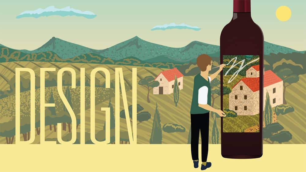
Wine labels are some of the tiniest canvasses on which artists and designers can make a bold statement to lure consumers. At one time, a touch of gold or silver foil was enough to catch a shopper’s eye on a crowded store shelf, and was a major step forward in elevating ho-hum labels to something jazzier. Wine-label designs are undergoing a renaissance of beauty and cleverness, together with some innovative technology, as part of larger branding efforts.
In early 2020, St. Helena-based CK Mondavi and Family began using a technology called thermochromic (temperature-sensitive) ink, to change the color of the labels on some of its chilled wine. The company introduced its seasonal Spritzed Rosé Moscato last spring with thermochromic labels, which transforms from a light cream color to a bright pink when properly refrigerated, at approximately 55 degrees.

“The thermochromic ink process is a fairly simple technology that’s been around for many years,” says Pam Novak, marketing director for Lifestyle Brands at CK Mondavi, which has its own in-house design team. “It means adding one more pass of ink color on the press. It’s great for consumers who are learning about wine and want to know the proper way to serve it. If the wine is served too cold, it can restrain the fruit.”
The initial idea for the color-changing labels began in a small batch of the wine, she says. “We put together a task force to brainstorm new product ideas, and this idea to change the color of the label rose to the top. We felt it was a great way to infuse excitement into the product and inform the consumer that serving temperature really matters. They chill the wine until they see the grape image and the color emerge on the label, and then they know it’s ready,” says Novak.
CK Mondavi and Family are using the thermochromic process for labels on all of their value wines that should be chilled. In addition, the company’s 75th anniversary is being celebrated this year with special labels, logos and emblems on all its wine bottles and related packaging.
Developing brand DNA
The labels for Gehricke wines, one of the brands produced by Sonoma’s 3 Badge Beverage, are striking in their simplicity, with straightforward typefaces and a background color called dusty rose, says 3 Badge president August Sebastiani.
“The color is a big part of the look for the label, and the inspiration was from old photographs I came across of my dad in the winemaking lab at Sebastiani Vineyards. I hadn’t been born yet, but it was great to harken back to that era. The handwriting on the side of the label is mine, inspired by old lab notes. Every 18 months or so I write tasting notes about the wines, and those are incorporated into the design. My handwriting is hideous and illegible,” he adds with a laugh, “but that feature on the label helps to tell the story of the wine and makes it more transparent.”
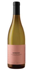 The Gehricke line includes bottlings of several varietals, both whites and reds, and all feature the dusty rose-colored label.
Sebastiani refers to 3 Badge’s label design team as a “mixed bag,” with an in-house senior designer who handles much of the art direction, and outside design firms tapped for some projects. “We refer to our method of developing a look as ‘brand DNA,’” he says. “That’s what we want a brand to look like as it comes together, and when it goes from academia to the retail level, it can become a different animal. Your brand isn’t what you say it is, it’s what your customer says it is.”
Designing labels at 3 Badge Beverage starts with a DNA breakdown, which Sebastiani describes as a two- or three-page evaluation compiled by the marketing team. “It talks about what we are looking for in an abstract sense, whether more traditional or more modern, or more rugged or more polished. One of the questions we ask the team is, ‘If this brand was a celebrity, who would it be? Or if this brand was a car, what would be the make and model?’”
From that discussion, a summary of ideas is sent to the designer, whether handled in-house or with outside assistance. “It’s not so much about being a roadmap for the designer, but an idea of where we’d like the brand to land. When it comes to the design, it’s invaluable to let the designers design. One of the fatal flaws in the wine industry is trying to design by committee. At 3 Badge we say, ‘You’re the artist, you do the art.’ We might make a small nudge to the look here and there, but I’m very sensitive to not micromanage.”
The 3 Badge portfolio doesn’t rely heavily on retail shelves, Sebastiani says, but the one constant that applies across the board is that a label is the first impression to sell the first bottle, and what’s in the bottle will sell the second or third. “Whether it’s on a grocery store shelf or in a bottle shop or lit up on the back-bar of a lounge, the takeaways by the consumer may be different. In a grocery store, the bottle is only a couple feet away and might have the right color or label shape [to appeal to the consumer], but on a back-bar it appears differently. I refer to it as like comparing the baseball swing to the golf swing.”
Strategic packaging necessary
Knowledge of the latest innovations in paper, printing and technology can make a wine-label designer’s job challenging, but also opens up many more creative possibilities than in years past. “Today, there are lots of substrates that can be used for labels, and there is always innovation with printing presses,” says David Schuemann, owner and creative principal at CF Napa Brand Design. “Digital printing has also gotten a whole lot better. Printed technologies can include greener materials and also things like lightweight bottles. Those types of innovations have come a long way and continue to do so.”
CF Napa has trademarked the expression: “Drink With Your Eyes.” It explains their philosophy about wine label and packaging design. A statement on the firm’s website reads: “In testing, we’ve seen consumers detest the taste of a beverage if it came from a package design they didn’t like, and conversely have seen the exact same consumers love the taste of the same beverage when it came from a package design they found pleasing. Thus, strategic packaging design is not just an aesthetic exercise, but a commercial necessity.”
That’s a powerful test result. And CF Napa goes further than the initial impression of a label, too. “We have clients who are looking for true traditional [wine label] design, but the vast majority want to develop a brand, not just a label,” says Schuemann. “They want all the related packaging to create a cohesive message, especially those wineries and other beverage producers that do a lot of direct-to-consumer sales.”
He says some clients usually have ideas of what they are seeking in a design when they first enter into conversations with his firm. “It depends on whether they need a new design or a redesign, but we take them through an extensive business discussion, finding out their likes and dislikes of brands already on the market,” he says. “We work closely with our clients to establish the story behind the brand, then how to pictorially create a wine just through telling its story. Typically, we work up four or five designs on a new packaging project, while the industry standard is three. But that can vary a lot depending on budget.”
Small family-owned wineries see label and packaging design as a highly personal decision, according to Schuemann. “It depends on what they are trying to accomplish. Some are passion or retirement projects, so we try to find out an owner’s business objectives right up front.”
Some technology such as augmented reality (AR), which coaxes consumers to scan a wine label with their smartphones to read a variety of virtual information about that particular wine, have never really taken off, according to Schuemann. “AR is a little gimmicky, and over the past year, people have not been lingering in stores to read stories on their phones before deciding on a wine.”
Evolving label designs
Lail Vineyards, one of CF Napa’s clients, is a small Rutherford-based label that produces roughly 5,000 cases annually.
“We started working with David and his firm to update our graphics and website a few years ago,” says Lisa Dolan, Lail’s director of business operations. “When our relationship began, they held a ‘DNA’ session with us, creating storyboards to show that they truly got who we are. They’ve always done a great job of listening and interpreting out vision.”
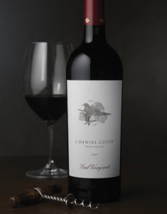 Proprietor Robin Lail, who is descended from Napa Valley wine pioneer Gustave Niebaum and whose father, John Daniel, Jr., owned Inglenook and steered the winery to great success during his tenure, launched Lail Vineyards in 1995. According to Dolan, the original label for Lail’s J. Daniel Cuvée Cabernet Sauvignon had a fabulous, classic look, but as time went on, a change became necessary. “We felt the wines had evolved, and so should the label,” she says. “That meant changing the fonts, reducing the size of the bird image—which is a nod to the owner’s name—and adding an abundance of white, while retaining key branding elements.”
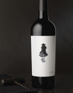 One of Lail’s granddaughters was the inspiration for another of her Cabernet bottlings, called Welly. That label, designed by CF Napa, shows the abstract silhouette of a young girl in rain boots and a tutu. “Wells Wilder Casten was about five years old when the label for Welly was designed and first introduced. The idea was to capture her high-energy spirit. It’s also a complete departure from anything our labels look like,” says Dolan. “It has a Rorschach ink blot feel to it, for sure. It’s a playful and fun look that captured exactly what we wanted. David and his team gave us at least five design ideas for the Welly label, but this one was a showstopper. It went on to be the winner of four packaging and design awards for CF Napa.”
Lail Vineyards doesn’t plan to use any of the technology that is catching on at some wineries, however. The winery’s clientele drives that decision. “We’re certainly open to new ideas, and we find QR codes and animated labels interesting. But we don’t think they’re in sync with our brand and demographic,” says Dolan. “Lail Vineyards is more of a traditional wine house.”
Remaining relevant
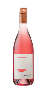
One of the newest labels for C. Mondavi & Family is its Flat Top Hills line of wines, which currently has a case production of 25,000 to 30,000—and growing. According to Novak, the wine is targeted toward Millennials and Gen-X consumers, with a $15 to $16 price point for a 750ml bottle. “The label is modern and understated, minimalistic and clean, and with a bit of copper foil on it. What stands out on the label is the cutout of a wine glass, with the wine showing through. It gives consumers a sense of discovery, and it almost looks like a smile.”
As labels and brands evolve and time goes on, she adds, “You want to keep your look fresh and stay relevant in the marketplace.”